
Typography
The Foundation’s typographic voice is bespoke to the institution. It is designed to engage with the nuance of Paulinne’s contributors and disciplines, providing a coherent framework through which diverse forms of expression can emerge.
The system combines three typefaces, with the serif typeface Magister at its core. Its structure is dynamically adaptable, capable of shifting between contemporary research contexts and expressive artistic outputs. Reflecting the complexity of the systems it represents, the typographic framework enables fine-grained control over textual hierarchy, while also allowing for decisive shifts in tone and mode of communication.
The following pages introduce the three Foundation typefaces, the system by which they combine and devices by which to structure a page or asset.
Introducing the typefaces
Typeface Information
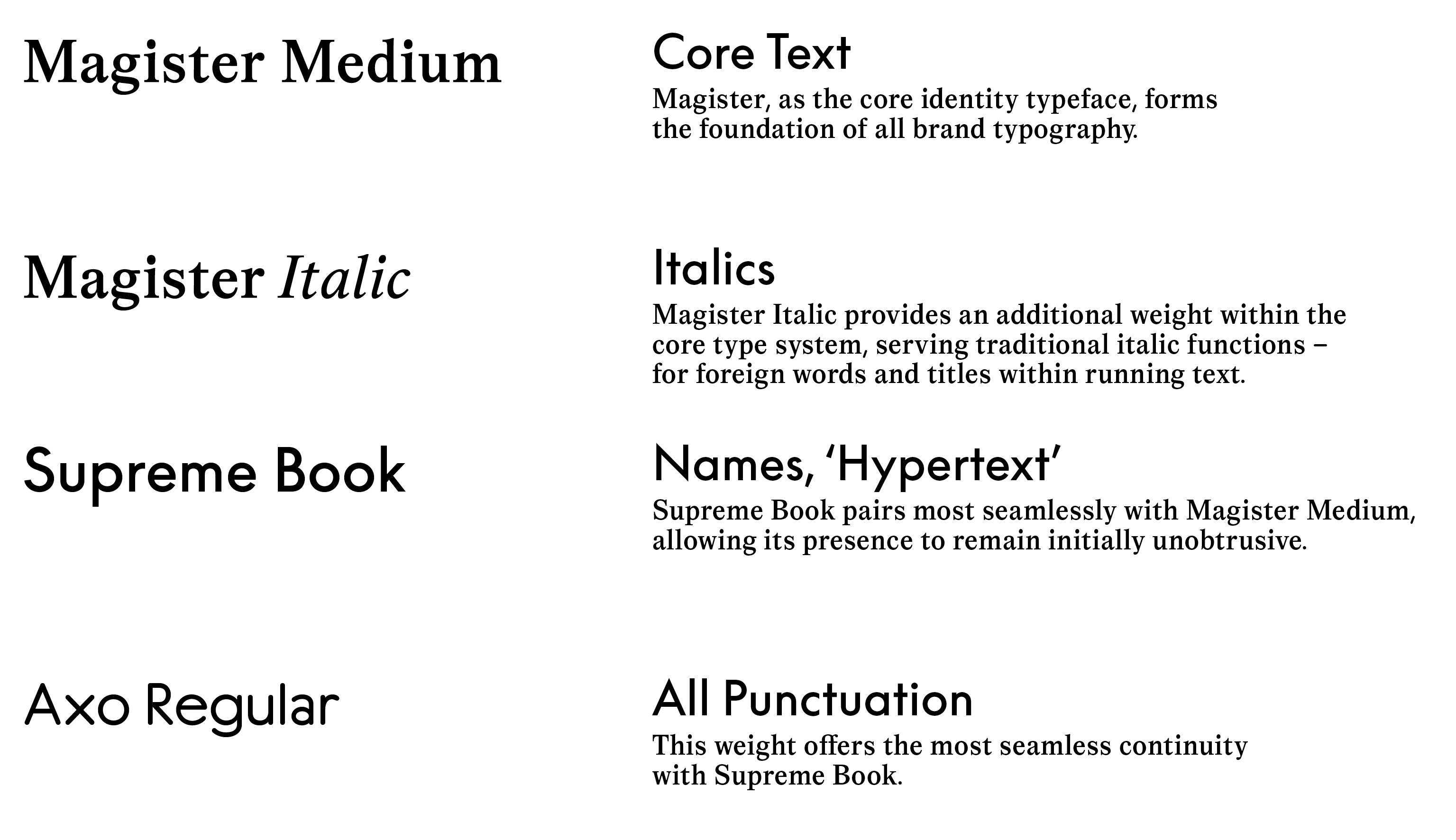
Magister, set in medium weight, forms the typographic foundation of the Paulinne identity.
Designed by Aldo Novarese in 1966, Magister is a modern Roman–transitional typeface that bridges the classical elegance of mid-century Italian typography with the functional clarity associated with Times New Roman. It offers a cultivated alternative to the latter’s utilitarian character, retaining authority and high readability while introducing greater refinement and stylistic presence.
The version used by the Foundation is a contemporary revival of the original design. As such, it extends Magister’s inherent legibility by re-evaluating spacing, proportions, and inter-letter relationships for both print and digital contexts.
Magister Bold Extended should never be used across the identity and is only applicable within the core and sub-logo symbols.
In keeping with the premise of revival typefaces, Supreme serves as the Foundation’s sans-serif counterpart within the identity system. Its role is to provide an alternate voice and visual language that works coherently with Magister, supporting a contemporary, flexible, and expressive typographic system.
Supreme is a reinterpretation of Futura, built on principles of pure geometry while rethinking how such construction functions within today’s digital contexts. As a modernist voice, it merges unexpectedly well with Magister, aligning through shared character heights and proportional logic to form a balanced and considered pairing. Its geometric emphasis subtly distances it from the ubiquity of classic Futura, while aligning its essence with the radial and structural forms of the sundial framework
Axo, the tertiary identity typeface, reflects the structural transparency between the Foundation’s serif and sans-serif voices. Used exclusively for punctuation, Axo acts as a stitch, binding these systems together.
Rooted in precision, penmanship, and the pedagogical traditions of teaching handwriting across Europe, the typeface carries a softly authoritative character. Though subtle and often unnoticed at first glance, Axo introduces a distinctive textural and contextual layer that enriches and elevates the Paulinne typographic system.
Type System Introduction
The Foundation’s typographic voice is bespoke to the institution. It is designed to engage with the nuance of Paulinne’s contributors and disciplines, providing a coherent framework through which diverse forms of expression can emerge.
The system combines three typefaces, with the serif typeface Magister at its core. Its structure is dynamically adaptable, capable of shifting between contemporary research contexts and expressive artistic outputs. Reflecting the complexity of the systems it represents, the typographic framework enables fine-grained control over textual hierarchy, while also allowing for decisive shifts in tone and mode of communication.
Supreme
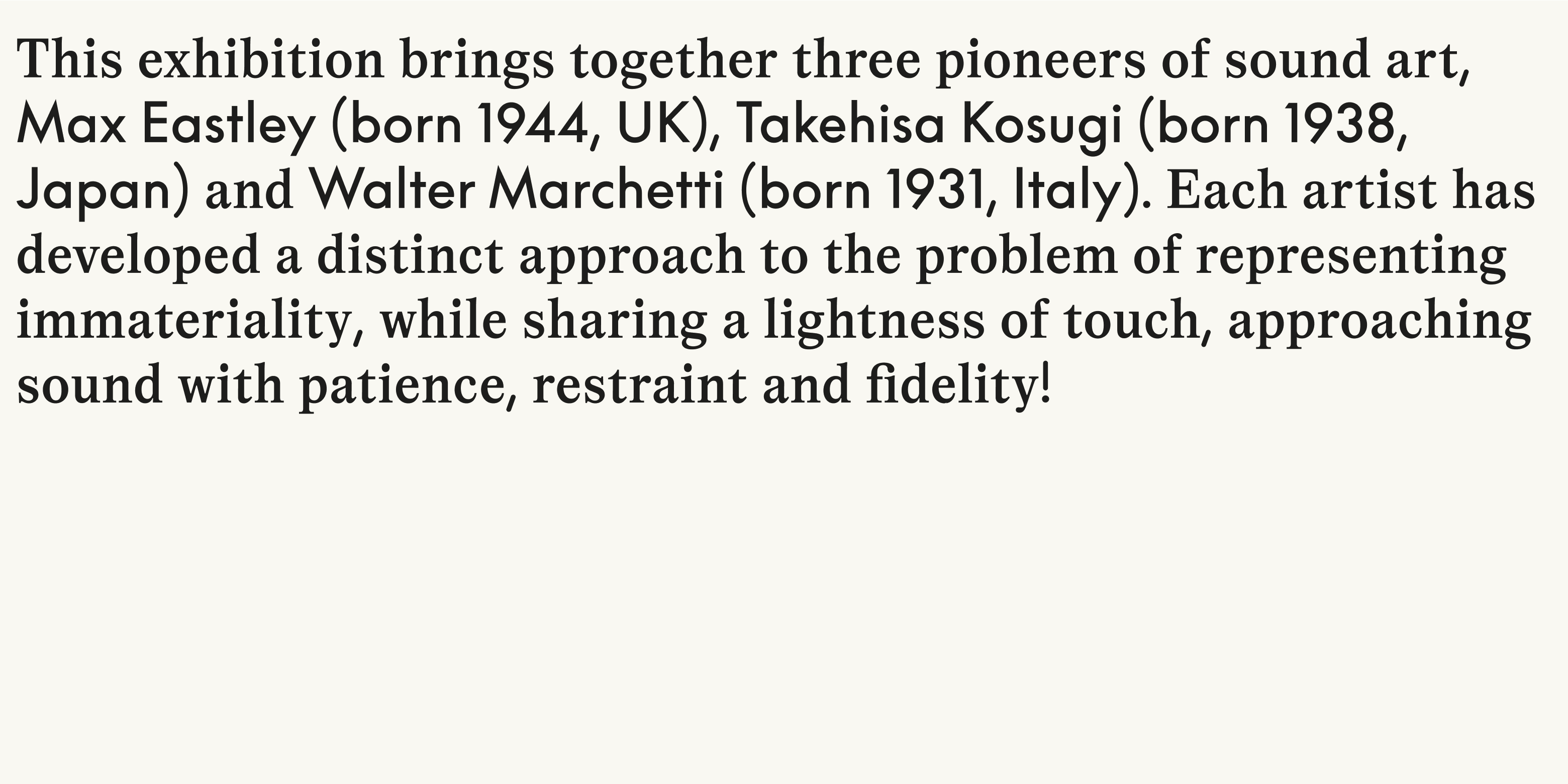
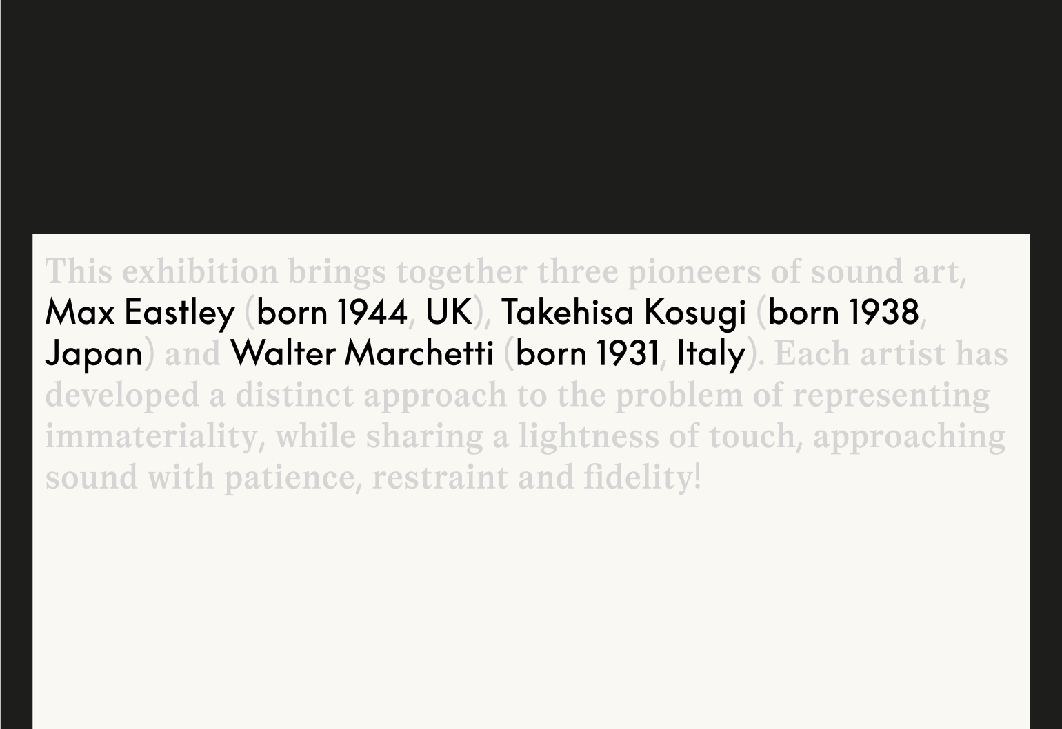
Supreme forms the “hypertext” layer of our copy. Rooted in ideas of linking, ecosystems, and transparent networks of thought and output, it is used to highlight connective or informational elements within the text. This includes names, dates, locations, pull-out information or quotations, numerals, and technical specifications.
Axo
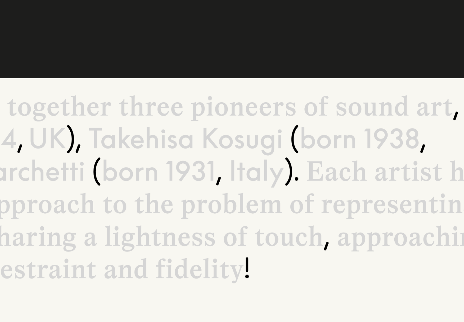
Axo is used for all punctuation, creating a visual bridge between Magister and Supreme and unifying the overall texture of the text. Axo is not used for numerals.
A modified Magister typeface is supplied in which all punctuation is automatically substituted with Axo Regular.
This typeface is called Magister ST Axo Punctuation.
The use of Supreme is applied manually and requires editorial
or design oversight to identify and deliberately assign the appropriate words or statements as per the guidance within this document.
The Paulinne mixed typography system should be applied consistently across all brand outputs, from small printed assets to large-scale exhibition vinyls.
In long-form texts, the system may be selectively simplified and the typefaces applied in alternative ways, for example, setting body copy entirely in Magister with footnotes in Supreme, or adopting other combinations appropriate to the format. In such cases, titles or introductory abstracts should continue to express the core identity through the established typographic system.
Download Fonts
Access our approved typefaces for all brand and communication use. Installing these fonts ensures consistent typographic styling across every platform and touchpoint.
View Guides
Explore our typography principles, including hierarchy, spacing, and tone of voice alignment. Learn how to combine type, weight, and scale to create impact while staying true to our brand personality.
Type Layout
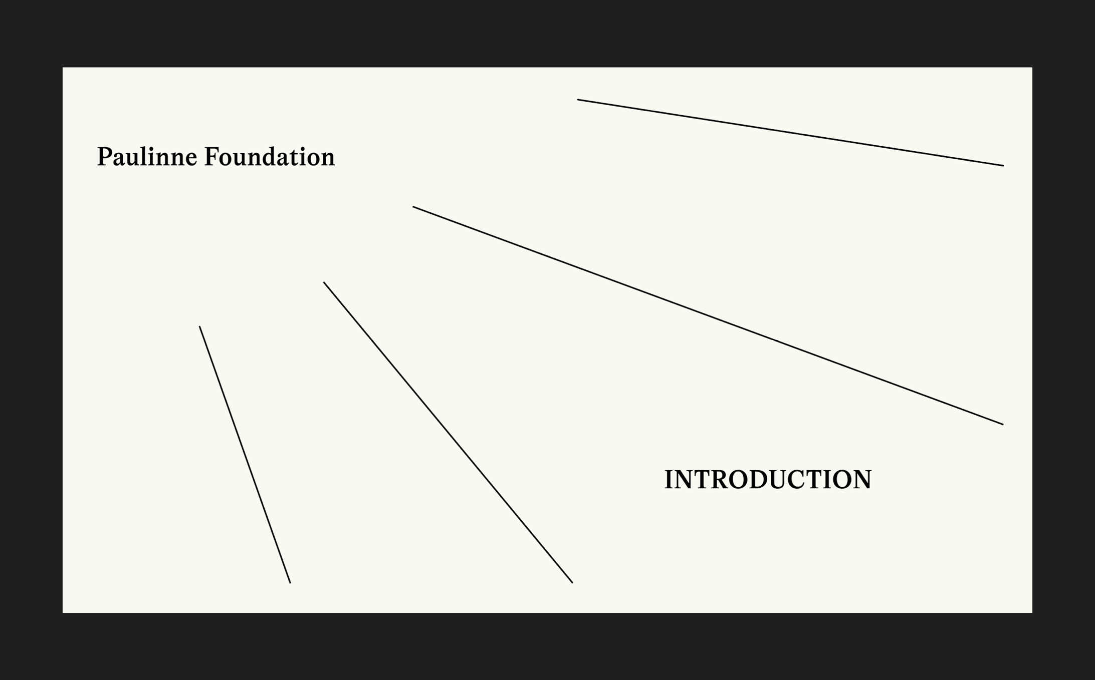
Sundial framing serves as the primary device for expressive typographic layouts. Type radiates in varied ways from a shared point of origin. For example, within this deck the top-left corner functions as the core focus, with text extending outward in hierarchical tiers and line work at times reinforcing this underlying structure.
View Applications
Lorum Ipsum