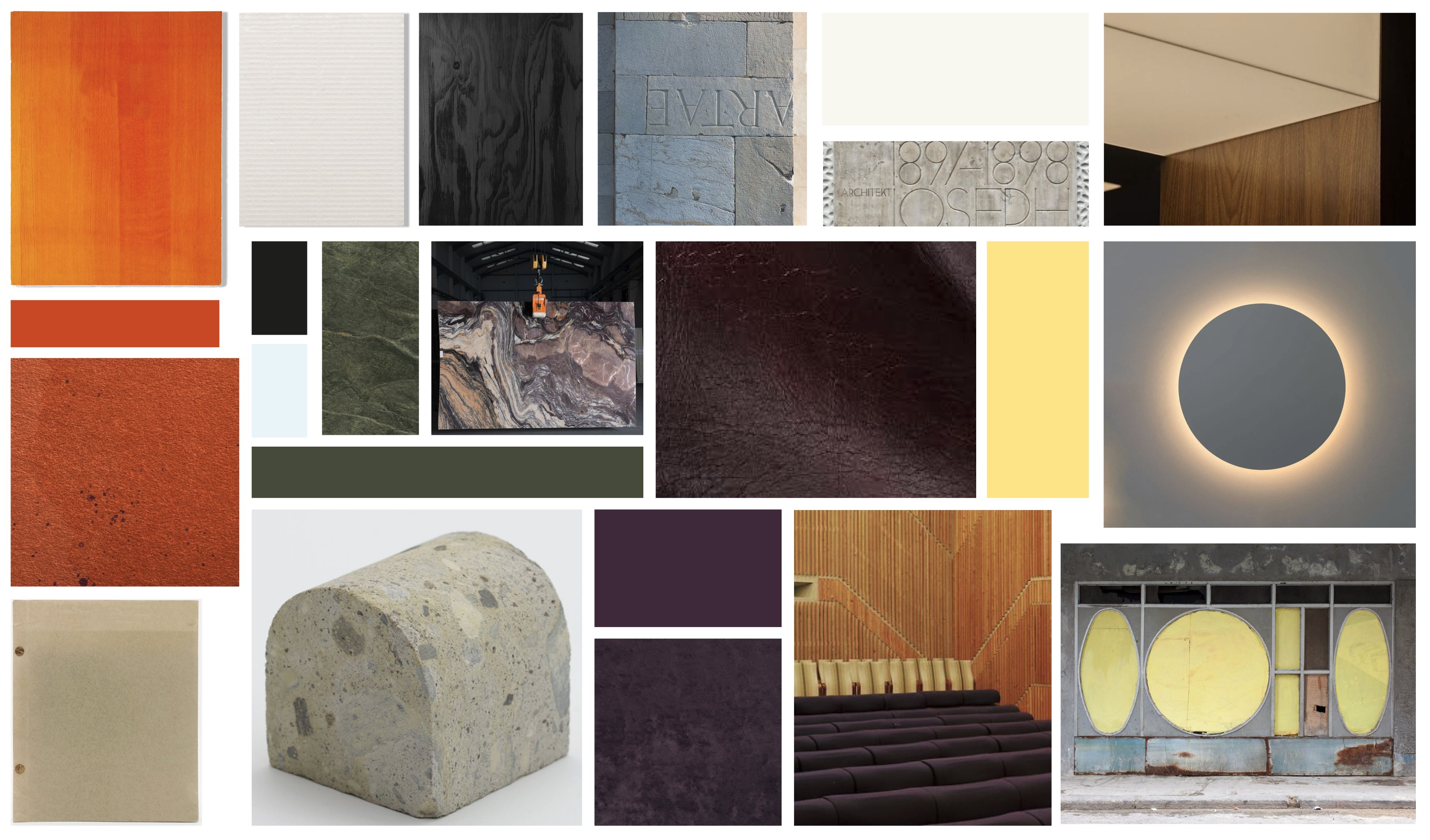
Colour
The Paulinne colour approach enables the Foundation to move fluidly between
warmer and cooler tonalities, ranging from unexpected neutral pairings to rich, dense colour combinations.
It draws on naturalistic references, marble, chalk, dappled light, and fields of wheat, acknowledging the relationship between elemental materials and cultural or social expression.
Colours within the Paulinne identity are named after their elemental or pigment-based origins and are understood both as precise flat colour values and as points of departure for a broader, more atmospheric and materially expressive palette. A fern green may reappear as flecks within mixed stone; an off-white inspired by Dutch Process White Lead may translate into the soft, luminous warmth of a lamp set against a deep velvet cinema chair.
Colour
Colours and colour names are inspired by their related natural pigments –
as documented within The Harvard Art Museum’s Forbes Pigment Collection.
Colour: Values for Different Media
This version is used when there is the option to print with Pantone inks.
This version is used when printing in CMYK.
This version is to be used in all digital contexts, both online and offline, such as social media imagery or screen displays.
Only the Paulinne black is supplied with a greyscale equivalent. This is only to be used when completely necessary and never when it is possible to use the alternate print swatch.
Colour: Lamp Black
The Foundation uses a specific black swatch with enhanced tonal depth, defined by a Pantone value inspired by Lamp Black pigment – a deep black soot traditionally produced through the burning of mineral oil, tar, or resin, and an associated London ‘smog’.
Lamp Black is precisely defined and applied universally across all contexts. Dedicated Pantone, CMYK, RGB, and Greyscale values are provided and must be used consistently in both print and digital applications. These values apply to all uses of black, including solid colour fields and typography.
Colour: Approach
The Paulinne colour approach is intentionally broader than traditional branding rules. While each colour swatch remains strictly defined for print and digital use, the system allows for greater interpretive freedom across physical materials and textures. In these contexts, exact colour matches may be replaced with tonally aligned expressions or a broader reading of the Paulinne palette, such as green flecked through stone, or the radiating warmth of yellow cast from a lamp onto a purple velvet cinema chair.